Page 1 of 2

Speaking of interesting signage

Posted: Fri Jan 16, 2009 4:27 pm
by Jim O'Bryan
weeks ago I posted this very illegal, and hideous trend.

Image

Now it would appear the Beck Center has brought this trend to
their new facade and commercial effort!

Image

PLEASE this is just so bad, ugly and illegal!

Let's try to make the city look better, not worse.

.

Posted: Fri Jan 16, 2009 4:51 pm
by Will Brown
What's illegal about putting a sign on a parked car? I recall a nice restaurant in LA where the owner parks his classy classic roadster in front every day to help people find the restaurant in a nondescript block; I found it very helpful, but it did tie up a valuable parking spot.

Posted: Fri Jan 16, 2009 4:57 pm
by sharon kinsella
Around the Corner does it in their old roadster all the time.

Re: Speaking of interesting signage

Posted: Fri Jan 16, 2009 4:58 pm
by Jim O'Bryan
Image

Image

Here is the question...

Was the original plan for the Beck scrapped by this administration
for the new, er, ahhhh, errrrr, ahhh antique look?

Will

I would think at best it would need a temporary signage permit, which
has no place for car signs. As I mentioned first thing to go out the window
was those little A-Frames we have to walk around. Now everyone has them
which makes them even harder to read, and nearly pointless.

Then we have Put-In-Bay hand painting signs weekly on the truck that
never moves, and looks er well like a van someone would live in down
by the river.

Now we have this trend.

What is next? signs in the middle of the road?

.

Posted: Fri Jan 16, 2009 6:56 pm
by Corey Rossen
Jim, Would AGS print one of these signs for a company if they knew it was destined to be placed on a parked car? Morals or Money? Just pontificating, that's all.

Posted: Fri Jan 16, 2009 7:05 pm
by Jim O'Bryan
Corey Rossen wrote:Jim, Would AGS print one of these signs for a company if they knew it was destined to be placed on a parked car? Morals or Money? Just pontificating, that's all.
No.

We have turned down jobs that were banners to go on apartment buildings, because I think it really looks like crap, and "ghettoizes" neighborhoods. For the record I am not a fan of your A-Frames, or those at every other store in town.

We have turned down one advertiser that pulls a lit sign in front of the YMCA
and directs traffic to his gym.

One of the standing jokes in my office is that I have fired more clients than I have hired. (Don't tell your grandfather!)

I did pretty good selling my soul out to BP America, I finally quit that job when I had to make a map that explained why they should not pay the full cost of a spill in the Lima River.

.

Posted: Fri Jan 16, 2009 7:25 pm
by Ivor Karabatkovic
Jim,

Now it's art!

Image

Posted: Fri Jan 16, 2009 7:32 pm
by Corey Rossen
I agree the A Frames are not the best eye-pleasing way to go, but it has become a necessary evil. Interchanging signs and having special signage custom made becomes very pricey, as you know. Businesses eveywhere are trying to change, grow, and grasp the ever-elusive customer without spending their last penny in doing so. I would love to advertise more, in a larger media, on a constant basis--but realistically that is just not going to happen. Hi Ho, Hi Ho, so back to the boring A Frame we go.

Corey

Posted: Fri Jan 16, 2009 7:37 pm
by Jim O'Bryan
Corey Rossen wrote: I would love to advertise more, in a larger media, on a constant basis--but realistically that is just not going to happen. Hi Ho, Hi Ho, so back to the boring A Frame we go.
Corey
Corey

First I must say the window signage is great. Old style, classy and looks like they are easy to change in and out. The smoke glass with gold letters really adds to the corner.

We have just reviewed our ads, and because of the influx of funds from other projects we will be able to offer much less expensive ads, and the same deal in other Observers.

FWIW


.

Posted: Sat Jan 17, 2009 9:23 am
by Corey Rossen
The smoked glass signs do look great, and they were well crafted to easily be interchangeable--but let's be honest--how many people are reading window signs while going through an intesection with 2 traffic lights 15 feet apart and non-traditional intesecting streets. They are more likely to quick glance at an A Frame than rear end a car in front of them to slow down to read a window sign. Did I mention the street pole, telephone pole, crossing box, traffic light control box, city garbage can and mailbox that also are in front of the windows.

The window signs do a lot to the storefront and the only sign we ever hear mention of is the one facing east because cars are stopped at Cook Ave to have time to read it.

A Graphic company that came up with the Solution and created the signs did a fantastic job, but they still do not add revenue to the store, but I'm sure we had to pay revenue to obtain the signs.

Corey

Posted: Sat Jan 17, 2009 1:39 pm
by Anne Steiner
I agree. I was the opening manager at Caribou in Lakewood and we put up a professionally made banner on the front of the store, and we got in trouble for it and had to take it down

Re: Speaking of interesting signage

Posted: Sat Jan 17, 2009 8:14 pm
by Will Brown
[quote="Jim O'Bryan"]

Now we have this trend.

What is next? signs in the middle of the road?

.[/quote'

Tattoos. $5 for a shoulder, since they're seasonal; $25 for a forehead.

Posted: Sun Jan 18, 2009 10:00 am
by Jill Jusko
I don't see as many A-frames around as Mr. O'Bryan says exist, so I am not particularly bothered by them. However, this signage discussion does bring up a question I have quite frequently as I drive up and down Detroit and Madison. I know I could call the city and get an answer, but it's more a curiousity thing rather than a need-to-know.

While lots of nice window signage may exist, what I see primarily when driving down these streets is the signage above the windows. And it seems to me that vast amounts of it on both Detroit and Madison is brown lettering on a beige background, or beige lettering on a brown background, all with similar type faces. Is this some sort of requirement, or simply individual choice?

In my opinion, it's pretty bland and does little to highlight the individuality of the enterprises that inhabit the storefronts. Also, it doesn't brighten up the streets much. Obviously there are exceptions to my statement, but as a whole I think its pretty accurate. How much leeway to stores have to play with the colors and type faces on their signage?

Posted: Sun Jan 18, 2009 1:52 pm
by Jim O'Bryan
Jill Jusko wrote:I don't see as many A-frames around as Mr. O'Bryan says exist, so I am not particularly bothered by them. However, this signage discussion does bring up a question I have quite frequently as I drive up and down Detroit and Madison. I know I could call the city and get an answer, but it's more a curiousity thing rather than a need-to-know.

While lots of nice window signage may exist, what I see primarily when driving down these streets is the signage above the windows. And it seems to me that vast amounts of it on both Detroit and Madison is brown lettering on a beige background, or beige lettering on a brown background, all with similar type faces. Is this some sort of requirement, or simply individual choice?

In my opinion, it's pretty bland and does little to highlight the individuality of the enterprises that inhabit the storefronts. Also, it doesn't brighten up the streets much. Obviously there are exceptions to my statement, but as a whole I think its pretty accurate. How much leeway to stores have to play with the colors and type faces on their signage?
Jill

While it not as bad as you seem to think I believe, what bothers me is that it is a growing trend. That seems to be getting worse, and more over the top. At Cerny's Shoes, there was an A-Frame to answer the Rozi's A-Frame. Farther down the street with have a Curves A-Frame to answer the Cell-Company's A-Frame, to get more attention they no have a large flag. so one would wonder how does Curves answer this challenge.

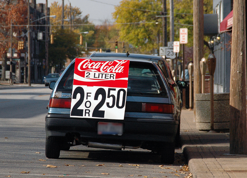
Sign escalation bothers me, and I own a sign company that sells A-Frame signs if needed but like magnetic signs on truck and cars I try to talk clients out of them. Some place they actually make sense like at the Library, one we did. They put it out a week before a book sale as they have no windows to put signage in. However it would be interesting to see what is a larger impact a sign, or an ad, or a story.

This would lead into an A-Frame on the street that says the same thing everyday, as opposed to Rozi's that they change often, so it is always grabbing attention. What is the affect on traffic does it offset the effect on sales? I do not have the answers, just the Observation.

As for the bland signage, from what I remember this goes back to 70s, when the city was trying to keep up with WestGate Mall and had decided on a standard look and color scheme for the city. Rosy Beige with Gold lettering. This slowly changed to brown lettering as people drifted and the city relaxed it stance. For over a decade neon was illegal and was grandfathered in. Deadhorse gallery was the first to just do it anyway, and Mayor Cain decided neon was hip and new and allowed it again.

Currently the laws are very tough especially for banners, and temporary signage, which an A-Frame would be considered. However those laws would appear to be ignored, as A-Frames were illegal, as was banners on residential buildings. Signage like that in all of the drugstores in town is illegal according to current code, as is using the name in more than one place or more than one business name on a building.

I suppose what bothers me most, is after carrying a $300,000 insurance policy, having to do many drawings for the building departments, including banners for temporary signage and paying fees. It would seem that others just do what they want. so what you end up with is this one block from city hall.

Image

Image

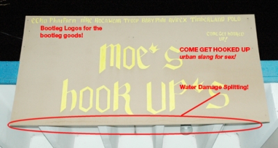
While it reduces the cost of start-up, it brings down the area, is a dangerous hazard, and very hard to explain to a client that just had to pay another $100 for a second rendering because the descender in their letter "p" was 1.4" too long as deemed so by the building department. As I pointed out the sign above was made with particle board that weighed about 50lbs, and was already falling apart when the "siding nails" held it to the roof kind of. In a rain the particle board falls apart and all 50lbs falls on a child and did the owner/sign company even carry insurance? Who gets sued? The city I would think for non-enforcement would be open to litigation.

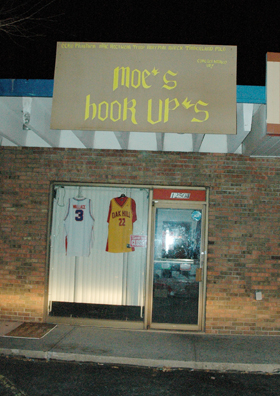
So the points I am always trying to make are plenty. Safety, even playing field, and how it looks and fits into the neighborhood. I would say that the look you and I both find boring is way over the top. But Moe's is way over the top in the other direction.

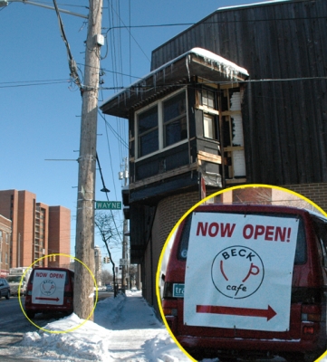
Finally, no matter how many signs LakewoodAlive comes up with, or how many studies, when hung in front of Moe's, it looks terrible. When hung in front of Geiger's or The Melt it will help define and mark an area to the betterment of all.

I want to mention that it is a dream dealing with the current building department. Ever since Mayor George worked to streamline the process, a trend the current administration is also pushing, it is far better for all to go through the process.


FWIW


.

Posted: Sun Jan 18, 2009 1:54 pm
by Jim O'Bryan
PS

With the city reducing much of Detroit to one lane, traffic is slow enough that if business actually created interesting windows and signage, people could easily read and enjoy them.

FWIW


.