Take the Color Survey!
Posted: Thu Jan 15, 2009 1:39 pm
Signage Color Selection: Community Input Sought
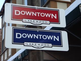
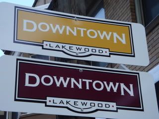
As part of its signage and wayfinding design project, the Downtown Lakewood Design Sub-committee is seeking community input on the color selection for street signs in the district. Four sign blanks, each a different color, have been posted on poles in the 14700 block of Detroit Avenue. The blanks are posted about 10 feet high; two colors are displayed in front of Geiger’s Clothing & Sports, the other two in front of The Melt Bar & Grilled.
Community input on the colors can be submitted through a survey located on the LakewoodAlive website: http://www.lakewoodalive.com
Please take a moment to provide your feedback. Once a color is chosen, the design project completed, and funding becomes available (timetable unknown at this time), Downtown Lakewood will implement this aspect of the Detroit Streetscape Plan. The result will be a functional and exciting signage and wayfinding program in our primary commercial district.
The historic color palette approved by the committee reflects the community’s expressed desire for traditional elements in the design, as determined at the October 2, 2008 public meeting on the subject.
The signage design project is funded by a grant award to LakewoodAlive from Heritage Ohio matched by the City of Lakewood, and is an outgrowth of the community-based Detroit Avenue Streetscape Plan funded by a grant award from NOACA and adopted by City Council in December of 2008.
Downtown Lakewood is a LakewoodAlive program to revitalize Lakewood’s primary commercial district using the National Main Street Four-Point Approach™.
LakewoodAlive is a nonprofit economic development organization dedicated to improving the quality of life of residents by creating alliances with community leaders, leveraging community assets and expanding the pool of available resources to facilitate economic stability and growth in Lakewood, Ohio.