J Hrlec wrote:So are you saying that improvements and construction should not cause any mess, or it's not moving fast enough for you? Or is the city incapable because a few signs are crooked. Just a little curious...
Just confused.
I get this often, thanks for asking.
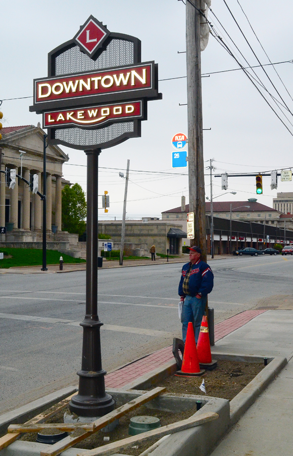
In this image, the point is. "Get the company hanging the signs to make sure they are straight, before they
pack up and leave." If it is the city, then, have the guys, who are very hard workers, get them right the first
time. If you look at the photos, 1 in 3 signs are crooked.
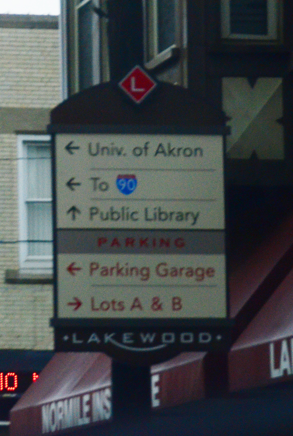
If we are doing this then lets do it right. CVS did it right, though it is amidst a ton of clutter. Clutter is
as unsightly on Detroit, as the guy withe never ending yard sales.
Lakewood, for whatever reason, has decided WE NEED WAYFINDING, so be it, let's do it right.
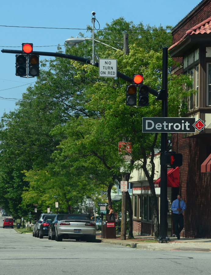
Consistency. One of the major perks of redoing signage, and wayfinding is so that you can take a second
and look at the full scope of the project and come up with an easy to use and understand standard. Sizes
all that same size, in the same locations, same color, same code and signaling. Over the course of decades
in a city sometimes there is design drift, but if one person is designing all of these at the same time, and
we are paying for them, even just 20%, lets get it right.
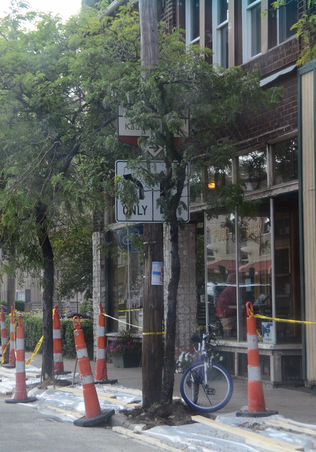
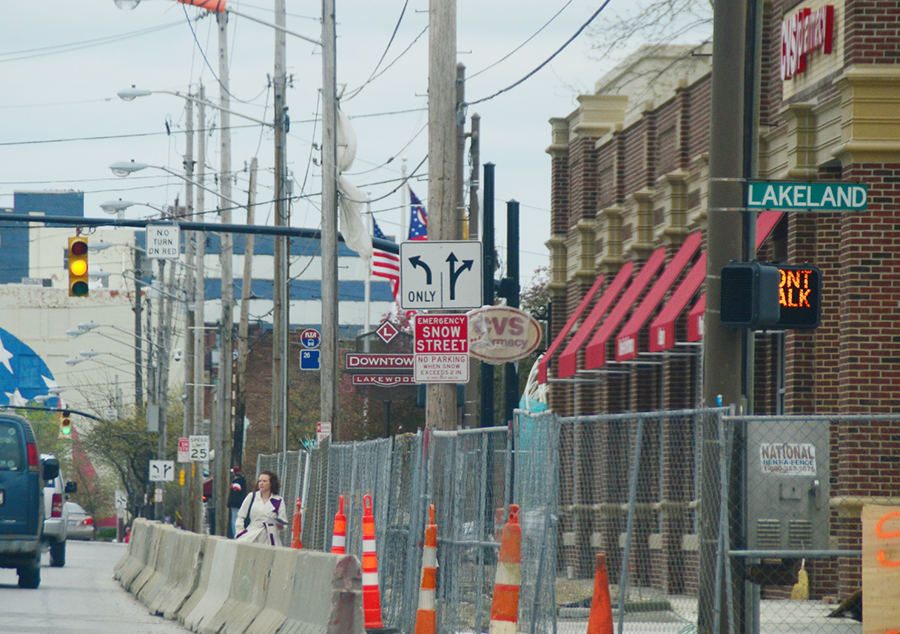
This is ridiculous, these signs were just put up with not trick photography. You simple cannot see the signs.
I would hate to see the tree cut down, but again, consistency and forethought with a plan. As we are under
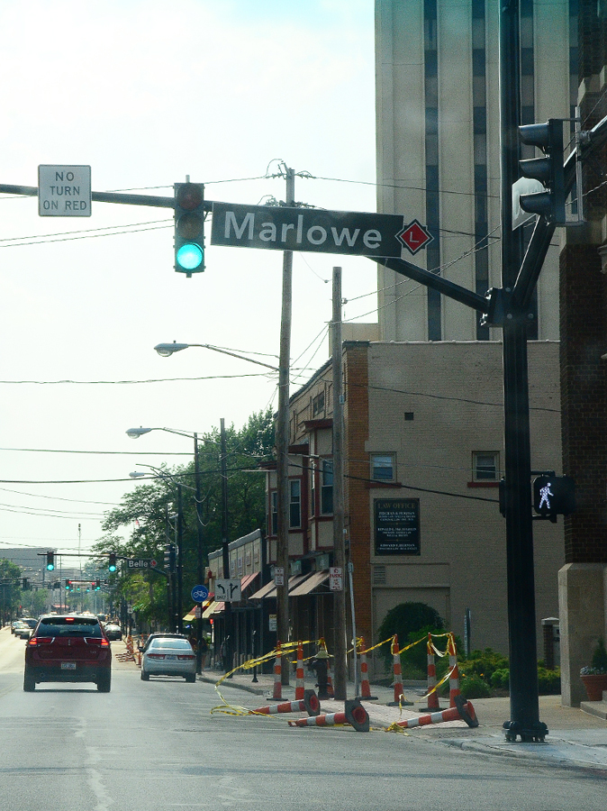
construction now, it is far easier to correct now, than after it is all done. There are actually 3 more poles after
this where the signs could hang, not of them as obscured as this. However they would all be obscured by
other signs. where is the plain. Are the signs just too big?
Once again, as we are in the middle of the project, now is the time for the city to get it right. Another issue
many have raised with me, is are the faux red bricks, supposed to be red or pink? If they are supposed to be
pink, then they nailed it. These will fade with age not darken, lets get it right while they are here, after all
the project is costing us $600,000 at least on the low end.
Lakewood crews, and many are my friends, yes still, work their asses off. But we all make mistakes, every issue
of the paper I get emails with typos, mistakes, etc. It is part of the business I suppose. I always mention to
them damn, I wish you were here before we printed the paper. I see these threads as nothing more than that
a chance for us, the people paying for this work, to go back and say, excuse me but that just isn't
right yet.
FWIW
.