Page 12 of 18
Posted: Fri Jan 30, 2009 9:49 pm
by Stephen Eisel
Jim O'Bryan wrote:Stephen Eisel wrote:The conversation between Stephen Eisel and myself were removed when he started indicating through "clickys" everyone that did not agree with the signs were asses.
That is only half true JOB... The a***** song was not intended for everyone who disagreed with me. It was intended for the folks who cop a negative attitude about everything that goes on Lakewood.

Thanks for the clarification

I rest my case.
.
I just wanted to be crystal clear.
Posted: Fri Jan 30, 2009 10:05 pm
by Jim O'Bryan
Stephen Eisel wrote:Jim O'Bryan wrote:Stephen Eisel wrote:The conversation between Stephen Eisel and myself were removed when he started indicating through "clickys" everyone that did not agree with the signs were asses.
That is only half true JOB... The a***** song was not intended for everyone who disagreed with me. It was intended for the folks who cop a negative attitude about everything that goes on Lakewood.
Thanks for the clarification
I rest my case.
.
I just wanted to be crystal clear.
I reiterate
I rest my case.
.
Posted: Fri Jan 30, 2009 11:21 pm
by Dustin James
Dustin James wrote: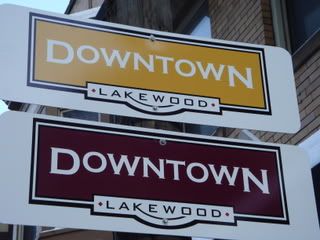
Remember this?
An original question that raised eyebrows, or created a doubt in credibility was this exercise.
Take the white letters on yellow proposition above. Take the public opinion poll out of it. A design firm that was serious about solving a signage and wayfinding "problem" would not seriously consider white letters on yellow as a viable solution. The legibility is almost not there. They would present such a solution to a private client at their own peril.
Take billboards, which are scaled up by magnitudes, still have the same fundamental principles because of distance.
The Outdoor Advertising Association of America in 1928, published their findings of exhaustive research into what color combinations are the most legible on a billboard. The best colors, in order of success, indicating more maximum contrast are
1)black on yellow
2)black on white
3)yellow on black
4)white on black
5)blue on white
6)white on blue
7)white on green
8)green on white
9)red on white
10)white on red.
What this indicates is that the color combinations had less to do with thought, than to placate a semblance of giving the public a "voice." Why?
If you are an expert, at least you would think through the relative visibility and legibility piece of the equation. Does anyone here believe that the public would overwhelmingly choose white letters on yellow? Why even ask?
It goes to the larger question that is being ignored. There was no RFP and why? Is this being picky? Is it because it's donated funds, that all the detail about WHY is being overlooked?
Again, this should not be about various personalities. The process of inclusion, to DL's earlier point takes a little longer, but ultimately creates a better product. Is this project so time sensitive, that it can't vet out bad design decisions? Exploration is a natural and iterative process in ANY design - as Jim said, including software (especially software, I will add).
I guess it's just weird to not hear from LA in any way but defensively! The above example shows conclusively that there were hasty decisions with the hope that no one would spot the error.
Okay. Can that error be admitted and a new process for inclusion be considered? Or is the silent treatment the new approach to collaboration in 2009. (hint, it doesn't work). Come on LA, what's the issue with opening up?
Just an observation.
.
Whatever about resting cases.....Back to the thread. There could be many more non sequiturs like "how's the weather?" but what does that have to do with this?
Early on, the premise was that that Studio Graphique was above questioning their reputation or product. That's fine.
However, product is product. The work is the work. Everyone has gone to a restaurant that was supposed to be the best, only to learn that the management and chef had changed. The product at hand can be judged for what it is or is not. If competition wasn't a factor, then small studios or agencies would never get bigger. There would just be one big one.
No private client would pay this kind of money without a plan, a design rationale and way more options. It's your money
just sayin'
.
Posted: Sat Jan 31, 2009 11:00 am
by chris richards
Why does it seem that when Lakewood does go outside for projects like this and the library that the work we get from these "renowned" companies is not even a fraction of the quality and inspiration as their other works?
Posted: Sat Jan 31, 2009 11:22 am
by chris richards
Posted: Sat Jan 31, 2009 11:30 am
by Grace O'Malley
I wonder if this is a case of "it costs more so it must be better?"
I have driven down Detroit and looked at those signs several times. The white and yellow sign is completely unreadable due to the lack of contrast
Dustin James pointed out that no knowledgeable designer would use that color combination for a sign. I wonder if Studio Graphique would be able to defend that color choice. If they were, indeed, experts at signage, shouldn't they know that the yellow/white combo is universally considered inappropriate as signage?
Do we really need "wayfinding" signs and kiosks to help us find our way down Detroit?
Has a problem been identified or is this a solution in search of a problem?
Could the money be better spent elsewhere? Like, for example, actually doing something to attract people to dine and shop Lakewood?
Posted: Sat Jan 31, 2009 9:26 pm
by Charlie Page
Grace O'Malley wrote:Do we really need "wayfinding" signs and kiosks to help us find our way down Detroit?
Has a problem been identified or is this a solution in search of a problem?
Could the money be better spent elsewhere? Like, for example, actually doing something to attract people to dine and shop Lakewood?
Agreed. It sounds like a complex and costly solution to a problem that doesn't really exist.
Even if the problem existed, aren't we putting the cart before the horse? It seems like we should be implementing the Detroit Avenue Streetscape plan first. Why even spend a nickel on signs prior to getting the Streetscape project up and running (and funded at $2,500 per lineal foot - 2007 cost)?
Posted: Mon Feb 02, 2009 12:25 am
by Charyn Compeau
I don't know the designers or what level of interactions they had prior to creating these logos, however, I can speak to my experience in creative work.
Frequently, as in more often than not, a designer does not have carte blanche to produce what they feel is the most correct product for a project. Colors, fonts, sizes, as well as specific logos and other design elements are often requested or demanded by clients. Even if the client gives a great deal of latitude, they still have the right to approve or disapprove of concepts. Very often even the most open-to-suggestion clients will ask for specific 'tweaks' when they see the first few mock-ups. More commonly the direction starts much earlier.
Again, I do not know the process that was actually followed here (other than what wasa posted) so this is not for nor against anything. I just want to point out some of the realities that designers face.
Posted: Mon Feb 02, 2009 7:50 am
by Jim O'Bryan
Charyn Compeau wrote:Frequently, as in more often than not, a designer does not have carte blanche to produce what they feel is the most correct product for a project. Colors, fonts, sizes, as well as specific logos and other design elements are often requested or demanded by clients. Even if the client gives a great deal of latitude, they still have the right to approve or disapprove of concepts. Very often even the most open-to-suggestion clients will ask for specific 'tweaks' when they see the first few mock-ups. More commonly the direction starts much earlier.
Again, I do not know the process that was actually followed here (other than what wasa posted) so this is not for nor against anything. I just want to point out some of the realities that designers face.
Charyn
This is so true, which always come back to the question, which is not as an important as how much this whole thing will cost, and why, but who really designed it, now that we know it was not the "study group?"
Of course in the designers I hand with we have a saying that I am sure you can agree with. "The cruelest joke to play on a client is to give them what they ask for." As the client is usually the least informed on what can be done.
Or one could simply say, "flower baskets."
Hope everything is going well for you, you are missed her in Lakewood.
.
Posted: Mon Feb 02, 2009 10:00 am
by stephen davis
Jim O'Bryan wrote:Or one could simply say, "flower baskets."
Here's a post from August 16, 2006.
Lynn Farris wrote:By contrast, this is a picture that Don took Sunday evening of Lakewood's flowers. These were relatively healthy - there were some that were really dead.

This isn't a great picture, I know, but it does illustrate a little bit the height issue.
On the contrary, Lynn, it was a great picture. Even 2 years later, it illustrates many issues.
Steve
.
Posted: Mon Feb 02, 2009 11:24 am
by sharon kinsella
So, would it be safe to say that Studio Graphique is being thrown under the bus for this?
Posted: Mon Feb 02, 2009 1:32 pm
by stephen davis
sharon kinsella wrote:So, would it be safe to say that Studio Graphique is being thrown under the bus for this?
I don't know them, but Studio Graphique may be the best in the world at what they do. Sometimes the problem lies in the client. All too often, client philosophy and aesthetics override effective design. As Jim O'Bryan said, sometimes, the cruelest thing you can do is give the client exactly what they asked for.
Changing the look or order of an environment is a complex problem. Studio Graphique has to create designs that can be manufactured, fit in a cultural and physical environment while considering sight lines, existing obstacles and clutter, and ultimately inform, and generate the desired aesthetic/emotional/psychological outcome.
Studio Graphique can measure certain things, and may be totally aware of proper design and color choice, BUT they may have been asked to ice a cake that hasn't been baked yet. It's tough to create a winner with a lack of, or incorrect, information. Client management is an underrated skill.
If the idea/design of this signage seems flawed, you might ask if the client (LakewoodAlive) philosophy/aesthetic is in tune with the reality of Lakewood environment and culture?
Posted: Mon Feb 02, 2009 4:02 pm
by Lynn Farris
I agree with Steve. We don't know the constraints under which Stuido Graphique was working.
But I think we have some more basic issues here.
1) What is the goal or Mainstreet/Lakewood Alive? Is it to promote Lakewood Businesses? Then why give the business to a firm outside of Lakewood without even doing an RFP to allow Lakewood Businesses to bid for this design work. To make the assumption without even an RFP that no Lakewood business could do this work, doesn't sound pro-Lakewood business. It disturbs me that if we can't get a group that alledgedly is supposed to promote Lakewood Business to do an RFP to consider Lakewood Business, how can we get the City Government, the Schools, the Hospital and other people to consider Lakewood Businesses first. I have to ask, was there a down side to doing an RFP and just finding out if a Lakewood Business could do the work better and less costly?
2) Do we need signs to indicate the Downtown area? Particularily from within Lakewood. It seems to me that Jim may have hit on a better idea with his DADA and MAMA concepts. We have buisnesses up and down Detroit and Madison Ave ideas. Does focusing on the downtown area hinder businesses on both sides of the somewhat artifically designated area and Madison Ave. completely. I would love to see signs on 90 focusing on getting people to these business districts. There are always signs on the highways about gas stations and restaurants. Why are they missing from the exits in Lakewood? Maybe signs to help our guests get back to I90 would also be helpful.
I could also see signs from the HS and stadium so that after games, meets, matches whatever, our guests could stay and get a pizza or refreshments from one of our many restaurants. Likewise Winterhurst is a good place to direct people to these areas.
Would electronic signs, where we could indicate events and feature different businesses every day help promote Lakewood better? Geneva New York, has electronic signage that always shows the latest events in this small town so that you always know what opporunities you have for entertainment. Was this even considered?
I guess I'm curious as to who came up with the idea to put signs up to label downtown in Lakewood. Was this addressed as a need by Lakewood Businesses? Was this a problem with Lakewood Residents? Was there a survey of non-Lakewood people not knowing how to find it - and if so, didn't they need directions from the Shoreway or from I90? Or was this an idea thought up by someone who makes signs?
3) I agree with improving the streetscape. But these signs don't do it. I really liked the planter idea that Lakewood Alive did last year. We don't need to reinvent the wheel. Look at what other cities are doing. There are lots of nice benches, lights, bike racks etc. Coventry has some great ideas.
Posted: Mon Feb 02, 2009 8:31 pm
by Jim O'Bryan
Lynn Farris wrote:
3) I agree with improving the streetscape. But these signs don't do it. I really liked the planter idea that Lakewood Alive did last year. We don't need to reinvent the wheel. Look at what other cities are doing. There are lots of nice benches, lights, bike racks etc. Coventry has some great ideas.
Lynn
Thanks for the kind words but I might not understand Lakewood as well as Stuido Graphique, after all I just own an award winning design studio and sign shop and was the Lakewood Chamber of Commerce's Businessman of the Year while owning four businesses in the "downtown" district, so I could be in the dark on this one.
How many businesses are owned by LA in the footprint? How many started from scratch? How many are 100% devoted to Lakewood? Or is this the same nightmare when the WestEnd Strip Mall er "lifestyle center" was planned on the river with The Cliffs being Phase II, more like Phase ZERO now.
What got me driving home from the hospital today was how many empty storefronts are on Detroit, especially in the "downtown" footprint. I still say we are decorating for a party that might never happen. Especially if no one is willing to do the hard work OF PLANNING first.
FWIW
.
Posted: Mon Feb 02, 2009 9:15 pm
by sharon kinsella
I will add to that Economic Development.
Promotion of existing businesses to all residents and visitors - Dining Guide, Shopping Guide, Night Out?
Assistance with opening new businesses i.e. assist with building dept., law dept. requirements, help negotianting with building owneres, notifying potential owners of programs that will help them.
Where is all that, or are we just making some pretty and hoping for the best? (And the pretty ain't that pretty.)