Page 2 of 2
Posted: Sun Jan 18, 2009 2:05 pm
by Jill Jusko
That helps explain some things. Thanks.
Posted: Sun Jan 18, 2009 6:14 pm
by Jim O'Bryan

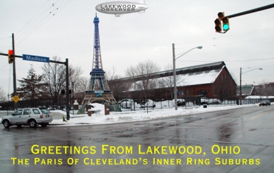
Another possibility of interesting signage for Lakewood's Gateway.
This plays off the "Paris of Cleveland's Inner Ring Suburbs" theme
that is catching on quickly around the county.
The Blimp, here sponsored by the Lakewood Observer could be
leased out to different vendors through out the year.
Presented to Lakewood Is Art it would create dramatic street art
that would see people come from all over to get their photo taken
at the gateway to Lakewood.
Is Lakewood ready for some fun?
FWIW
.
Posted: Sun Jan 18, 2009 8:21 pm
by sharon kinsella
We need Crumb to point to the tower and the blimp.
I think we're on to something here Jim.
No more serious and stuffy, new life, new day, new Lakewood.
Posted: Sun Jan 18, 2009 8:30 pm
by Jim O'Bryan
sharon kinsella wrote:We need Crumb to point to the tower and the blimp.
I think we're on to something here Jim.
No more serious and stuffy, new life, new day, new Lakewood.
Sharon
Crumb will actually be sweating while watering the Plover LEAF garden.
Shhhhhhhhhhhhhhhhhhh.
.
Posted: Sun Jan 18, 2009 11:06 pm
by stephen davis
Jim,
Perfect!
I was just reading an article about Kings Island amusement park and its 1/3 scale replica of the Eiffel Tower. There was some discussion about it being an "ANCHOR OF TOURISM", and a sidebar that said. "The most common "special request" at the park: couples wanting to get married there; most often at the Eiffel Tower."
So, an installation like yours at the Highland Square "Mini-Park" could become a destination for a lot of people. Transportation would be a breeze with the RTA Highland Square Station sharing the same intersection.
From Highland Square, tourists could take the Circulator bus straight north on historic Highland Avenue to the Highland Pier that was proposed by Dan Shields, and return through the new entertainment district.
Think of all the signage that would be needed for the influx of tourists.
With all these opportunities, Lakewood could easily become the signage capital of CLE+, adding 3,452 new, high-paying, jobs.
Steve
.
Posted: Sun Jan 18, 2009 11:18 pm
by Lynn Farris
Love your idea. It is fun.
But another question is what signs in Lakewood do you like? I think Maria's is one of the best I've seen.
http://www.mariaslakewood.com/
Posted: Mon Jan 19, 2009 9:56 am
by Jim O'Bryan
Lynn
Interesting Question, could use its own thread.
You have to also look at what the sign is trying to convey. Maria's is nice. However I have to think that Peck Engraving has the most beautiful sign in Lakewood.
Elements, have a very nice sign graphically a large neon "e" on plexiglass, plays nicely on the name and "design elements," bela dubby's sign captures the feel of the inside, and of course Rozi's plays off of the history, while staying very much inside of a very tight budget for design and trend. Phoenix coffee's logo of two years ago was also extremely spot on, when you remember that the owner had owned Arabica, and had risen out of the ashes to start a new and many think better coffee company. 56 West is also a very nice design.
FWIW
.
Re: Speaking of interesting signage
Posted: Mon Jan 19, 2009 11:02 am
by Jim O'Bryan
Jim O'Bryan wrote:
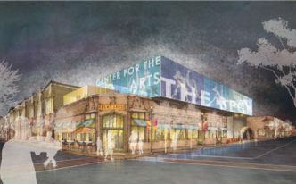
I just got off the phone with Lucinda Einhouse Director of the Beck Center. She has assured me that the facade was removed as part of an application for the historic registry.
This is part of an ongoing process and if there is any news to report, we will get it first at The Observer, but she does not see anything "breaking" until spring or summer.
BECK CAFE
The owner has generously taken the sign off the back of his truck, so please let's support the Beck Cafe, so that he does not ever feel the need to let us know it is open in that way again.
It is extremely comfortable inside, the coffee is good, and it would appear the pastries might come from 5th Avenue, another great Lakewood business. If you see me there and you will, coffee on me.
.
Posted: Mon Jan 19, 2009 11:23 am
by michael gill
Jim and Cindi,
I'm compelled to note that this bit about Beck Center's historic facade renovation was reported six months ago.
"The Beck Center for the Arts got a recent boost in curb appeal, thanks to landscaping by a local Boy Scout troop and restoration of the center's David Davis sculpture, on the lawn fronting Detroit Ave. The sculpture was commissioned by architect Fred Toguchi, who designed the center's main building. The restoration was carried out by McKay Lodge Fine Arts Conservation Laboratory and funded by gifts from "sculpture-loving friends."
But there's another bit of face-lifting on the block that could have significant long-term impact for the Beck. Brown wood siding and bars over second-floor windows, installed to help a street-car era storefront blend with Toguchi's mid-'70s brutalist design, have been removed as part of Beck's application for a historic-preservation tax credit. The hope is to return the exterior of that building to its original appearance and to return the interior spaces - now inefficient office and studio spaces - to commercial and residential space for lease.
http://www.freetimes.com/stories/15/64/arts-news
g
Posted: Mon Jan 19, 2009 11:44 am
by Bill Call
michael gill wrote:JBrown wood siding and bars over second-floor windows, installed to help a street-car era storefront blend with Toguchi's mid-'70s brutalist design,
I'm going way out on a limb here but what I have seen of American Architecture leads me to believe that architects are required to take a course titled: How To Make It Really Ugly But Still Cost A Lot Of Money.
Re: g
Posted: Mon Jan 19, 2009 12:19 pm
by Jim O'Bryan
Bill Call wrote:I'm going way out on a limb here but what I have seen of American Architecture leads me to believe that architects are required to take a course titled: How To Make It Really Ugly But Still Cost A Lot Of Money.
Bill
I think this is one of the problems that the "way finding street sign committee" could be running into. Time the killer of style. Some things like The Lakewood Public Library are timeless. Others like the facade on the Beck were very cool in their day. After speaking with Lucinda, and reading Michael Gill's fabulous article I agree where they are trying to go, and truly understand the concepts that were presented.
But this is a valuable lesson to learn, and one taught by one of the wisest men in Lakewood Kenneth Warren. We should strive to not capture cool, but go for timeless. In the long run, especially in this economy, it only makes sense.
.
Posted: Tue Jan 20, 2009 11:38 am
by Corey Rossen
My first hand experience with our A Frame is that it is working very well in terms of informing and attracting customers. People, both driving and walking past, have stopped in specifically because of what was mentioned on the sign. I would love to say this is true with our window signs but it is not.
Also, did you say that the Library doesn't have windows? About 50% of their front facade is windows, tall windows, enormous windows, very visable windows--I guess with your reasoning that they do not have windows it would make their A Frame justifiable in your view. Are you supporting their A Frame because you are in support of them or are you going back on your outspokenness (word?) of A Frames?
Corey
Posted: Tue Jan 20, 2009 3:03 pm
by Jim O'Bryan
Corey Rossen wrote:Also, did you say that the Library doesn't have windows? About 50% of their front facade is windows, tall windows, enormous windows, very visable windows--I guess with your reasoning that they do not have windows it would make their A Frame justifiable in your view. Are you supporting their A Frame because you are in support of them or are you going back on your outspokenness (word?) of A Frames?
Corey
Yes I do support the library.
What I meant was I did not think "Book Sale" signage was good for the windows.
I am not a fan of A-Frame signs.
To be honest I am not a big fan of clutter that takes away from store windows or proper signage.
FWIW
.
Posted: Tue Jan 20, 2009 3:24 pm
by Corey Rossen
Jim O'Bryan wrote:Corey Rossen wrote:Also, did you say that the Library doesn't have windows? About 50% of their front facade is windows, tall windows, enormous windows, very visable windows--I guess with your reasoning that they do not have windows it would make their A Frame justifiable in your view. Are you supporting their A Frame because you are in support of them or are you going back on your outspokenness (word?) of A Frames?
Corey
Yes I do support the library.
What I meant was I did not think "Book Sale" signage was good for the windows.
I am not a fan of A-Frame signs.
To be honest I am not a big fan of clutter that takes away from store windows or proper signage.
FWIW
.
Agreed.
Corey
